Card
<wa-card>
Cards can be used to group related subjects in a container.
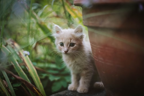 Mittens
This kitten is as cute as he is playful. Bring him home today!
6 weeks old
<wa-card class="card-overview">
  <img
    slot="media"
    src="https://images.unsplash.com/photo-1559209172-0ff8f6d49ff7?ixlib=rb-1.2.1&ixid=eyJhcHBfaWQiOjEyMDd9&auto=format&fit=crop&w=500&q=80"
    alt="A kitten sits patiently between a terracotta pot and decorative grasses."
  />

  <strong>Mittens</strong><br />
  This kitten is as cute as he is playful. Bring him home today!<br />
  <small class="wa-caption-s">6 weeks old</small>

  <wa-button slot="footer" variant="brand" pill>More Info</wa-button>
  <wa-rating slot="footer-actions" label="Rating"></wa-rating>
</wa-card>

<style>
  .card-overview {
    width: 300px;
  }
</style>
Examples
Jump to heading
Basic Card
Jump to heading
Basic cards aren't very exciting, but they can display any content you want them to.
<wa-card class="card-basic">
  This is just a basic card. No media, no header, and no footer. Just your content.
</wa-card>

<style>
  .card-basic {
    max-width: 300px;
  }
</style>
Card with Header
Jump to heading
Headers can be used to display titles and more.
If using SSR, you need to also use the with-header attribute to add a header to the card (if not, it is added automatically).
Header Title
This card has a header. You can put all sorts of things in it!<wa-card class="card-header"> <h3 slot="header">Header Title</h3> This card has a header. You can put all sorts of things in it! <wa-button appearance="plain" slot="header-actions"> <wa-icon name="gear" variant="solid" label="Settings"></wa-icon> </wa-button> </wa-card> <style> .card-header { max-width: 300px; } .card-header h3 { margin: 0; } </style>
Card with Footer
Jump to heading
Footers can be used to display actions, summaries, or other relevant content.
If using SSR, you need to also use the with-footer attribute to add a footer to the card (if not, it is added automatically).
<wa-card class="card-footer">
  This card has a footer. You can put all sorts of things in it!

  <wa-rating slot="footer"></wa-rating>

  <wa-button slot="footer-actions" variant="brand">Preview</wa-button>
</wa-card>

<style>
  .card-footer {
    max-width: 300px;
  }
</style>
Media
Jump to heading
Card media is displayed atop the card and will stretch to fit.
If using SSR, you need to also use the with-media attribute to add a media section to the card (if not, it is added automatically).

<div class="wa-grid">
  <wa-card class="card-media">
    <div slot="media" class="wa-frame:landscape">
      <img
        src="https://images.unsplash.com/photo-1547191783-94d5f8f6d8b1?ixlib=rb-1.2.1&ixid=eyJhcHBfaWQiOjEyMDd9&auto=format&fit=crop&w=400&q=80"
        alt="A kitten walks towards camera on top of pallet."
      />
    </div>
    This card has an image of a kitten walking along a pallet.
  </wa-card>
  <wa-card class="card-media">
    <video slot="media" controls>
      <source src="https://uploads.webawesome.com/dog-with-glasses.mp4" />
      <p>Your browser doesn't support HTML video</p>
    </video>
    This card has a video of a dog wearing shades.
  </wa-card>
</div>

<style>
  .card-media {
    max-width: 300px;
  }
</style>
Appearance
Jump to heading
Use the appearance attribute to change the card's visual appearance.
Outlined (default)
Filled-outlined
Plain
Filled
Accent
<div class="wa-grid">
  <wa-card>
    <img
      slot="media"
      src="https://images.unsplash.com/photo-1559209172-0ff8f6d49ff7?ixlib=rb-1.2.1&ixid=eyJhcHBfaWQiOjEyMDd9&auto=format&fit=crop&w=500&q=80"
      alt="A kitten sits patiently between a terracotta pot and decorative grasses."
    />
    Outlined (default)
  </wa-card>
  <wa-card appearance="filled-outlined">
    <img
      slot="media"
      src="https://images.unsplash.com/photo-1559209172-0ff8f6d49ff7?ixlib=rb-1.2.1&ixid=eyJhcHBfaWQiOjEyMDd9&auto=format&fit=crop&w=500&q=80"
      alt="A kitten sits patiently between a terracotta pot and decorative grasses."
    />
    Filled-outlined
  </wa-card><wa-card appearance="plain">
    <img
      slot="media"
      src="https://images.unsplash.com/photo-1559209172-0ff8f6d49ff7?ixlib=rb-1.2.1&ixid=eyJhcHBfaWQiOjEyMDd9&auto=format&fit=crop&w=500&q=80"
      alt="A kitten sits patiently between a terracotta pot and decorative grasses."
    />
    Plain
  </wa-card><wa-card appearance="filled">
    <img
      slot="media"
      src="https://images.unsplash.com/photo-1559209172-0ff8f6d49ff7?ixlib=rb-1.2.1&ixid=eyJhcHBfaWQiOjEyMDd9&auto=format&fit=crop&w=500&q=80"
      alt="A kitten sits patiently between a terracotta pot and decorative grasses."
    />
    Filled
  </wa-card><wa-card appearance="accent">
    <img
      slot="media"
      src="https://images.unsplash.com/photo-1559209172-0ff8f6d49ff7?ixlib=rb-1.2.1&ixid=eyJhcHBfaWQiOjEyMDd9&auto=format&fit=crop&w=500&q=80"
      alt="A kitten sits patiently between a terracotta pot and decorative grasses."
    />
    Accent
  </wa-card>
</div>
Orientation
Jump to heading
Set the orientation attribute to horizontal to create a card with a horizontal, side-by-side layout. Make sure to set a width or maximum width for the media slot. Horizontal cards do not currently contain the header and footer slots.
The actions slot is only available for the horizontal orientation
This card has a horizontal orientation with media, body, and actions arranged side-by-side.
<div class="wa-grid">
  <wa-card orientation="horizontal" class="horizontal-card">
    <img
      slot="media"
      src="https://images.unsplash.com/photo-1559209172-0ff8f6d49ff7?ixlib=rb-1.2.1&ixid=eyJhcHBfaWQiOjEyMDd9&auto=format&fit=crop&w=500&q=80"
      alt="A kitten sits patiently between a terracotta pot and decorative grasses."
    />
    This card has a horizontal orientation with media, body, and actions arranged side-by-side.
    <wa-button slot="actions" variant="neutral" appearance="plain"
      ><wa-icon name="ellipsis" label="actions"></wa-icon
    ></wa-button>
  </wa-card>
</div>

<style>
  .horizontal-card {
    img[slot='media'] {
      max-width: 300px;
    }
  }
</style>
Importing
Jump to heading
Autoloading components via projects is the recommended way to import components. If you prefer to do it manually, use one of the following code snippets.
Let your project code do the work! Sign up for free to use a project with your very own CDN — it's the fastest and easiest way to use Web Awesome.
To manually import this component from NPM, use the following code.
import '@awesome.me/webawesome/dist/components/card/card.js';
To manually import this component from React, use the following code.
import WaCard from '@awesome.me/webawesome/dist/react/card';
Slots
Jump to heading
Learn more about using slots.
| Name | Description |
|---|---|
| (default) | The card's main content. |
actions
|
An optional actions section to render at the end for the horizontal card. |
footer
|
An optional footer for the card. |
footer-actions
|
An optional actions section to render in the footer of the vertical card. |
header
|
An optional header for the card. |
header-actions
|
An optional actions section to render in the header of the vertical card. |
media
|
An optional media section to render at the start of the card. |
Attributes & Properties
Jump to heading
Learn more about attributes and properties.
| Name | Description | Reflects | |
|---|---|---|---|
appearanceappearance |
The card's visual appearance.
Type
'accent' | 'filled' | 'outlined' | 'filled-outlined' | 'plain'Default
'outlined' |
|
|
orientationorientation |
Renders the card's orientation *
Type
'horizontal' | 'vertical'Default
'vertical' |
|
|
withFooterwith-footer |
Renders the card with a footer. Only needed for SSR, otherwise is automatically added.
Type
booleanDefault
false |
|
|
withHeaderwith-header |
Renders the card with a header. Only needed for SSR, otherwise is automatically added.
Type
booleanDefault
false |
|
|
withMediawith-media |
Renders the card with an image. Only needed for SSR, otherwise is automatically added.
Type
booleanDefault
false |
|
CSS custom properties
Jump to heading
Learn more about CSS custom properties.
| Name | Description |
|---|---|
--spacing |
The amount of space around and between sections of the card. Expects a single value.
Default
var(--wa-space-l)
|
CSS parts
Jump to heading
Learn more about CSS parts.
| Name | Description | CSS selector |
|---|---|---|
body |
The container that wraps the card's main content. |
::part(body)
|
footer |
The container that wraps the card's footer. |
::part(footer)
|
header |
The container that wraps the card's header. |
::part(header)
|
media |
The container that wraps the card's media. |
::part(media)
|