Bring essential Web Awesome components and utilities into your Figma designs with the official Web Awesome Design Kit.
The Design Kit Can Lag Behind Web Awesome
Each component is built by hand in Figma, so the newest and most experimental ones take a while to arrive. <wa-data-grid> isn't in the kit yet.
To see what we're adding and track progress, follow the issue on GitHub.
Using the Design Kit
Grab the design kit to design mock-ups and prototypes with the same look and options you'll find in Web Awesome.
Open the file from your device's file explorer, or import the file in Figma's file browser. Follow the prompts in Figma to import the file into your Drafts or Project.
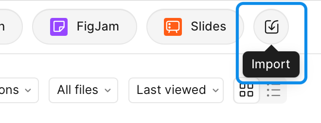
Open your Drafts and import from the top right corner
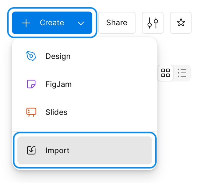
Open a Project and import from the Create menu
How you use the design kit depends on your Figma plan.
With the design kit open, simply copy and paste components from the design kit into your own files.
To share the design kit with your Figma team, publish the library. While viewing the design kit, open the dropdown next to the file name and press Publish library.
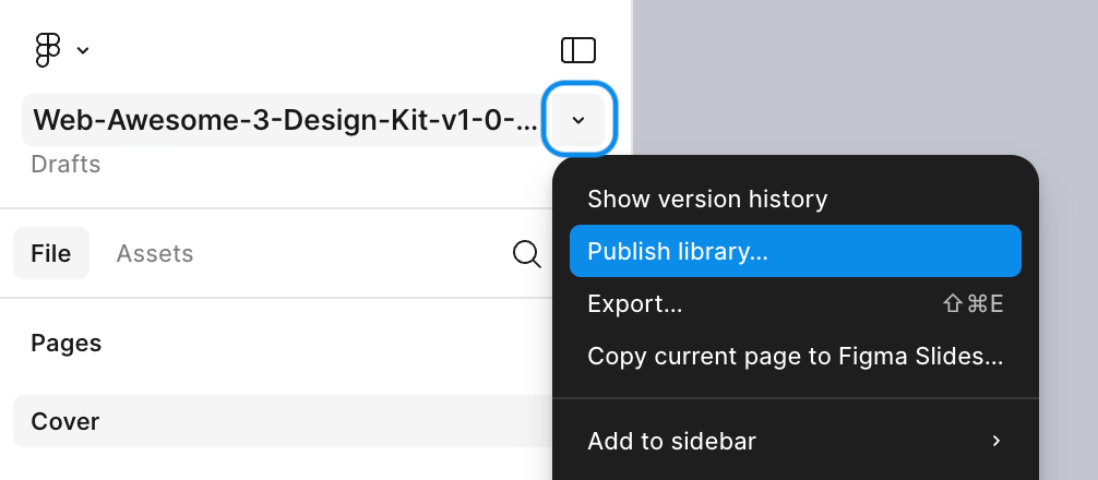
To use the design kit in a Figma file, go to the Assets panel and open
Start slinging components and design something awesome!
What's Included
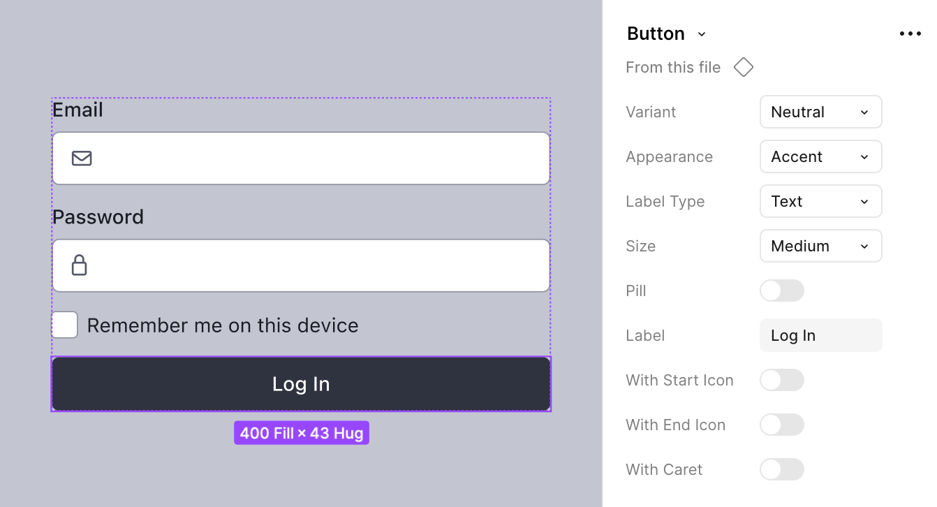
Gaps between design and development? No, thank you. We've used a number of Figma features to bridge those gaps and ensure as much parity with Web Awesome as we can muster, including:
| Figma Feature | Gap Bridged |
|---|---|
| Variables | Match Web Awesome's design tokens and bring the same look and feel of the Default theme into your Figma designs |
| Variable modes | Choose which of Web Awesome's free color palettes to use in your designs and switch between built-in Light and Dark modes |
| Text styles | Style body text, headings, labels, and more to match the typography in Web Awesome's native styles and text utilities |
| Effect styles | Easily apply premade shadows to elements based on Web Awesome's shadow tokens |
| Components | Enjoy the same composability we love about web components, powered-up with many of the same component properties you'll find in Web Awesome |
Limitations
Figma doesn't yet support many of the CSS features we rely on in Web Awesome. As such, there will be discrepancies in the variables, styles, and properties used in the design kit and those used in Web Awesome components. Here are some notable limitations:
| CSS Feature | Workaround |
|---|---|
calc() |
We use calc() extensively in our font size, space, border width, border radius, and shadow scales. In Figma, we've omitted each --wa-[property]-scale token, and rather than scaling variables based on a single multiplier, we use static pixel values. |
color-mix() |
We use color-mix() throughout themes to add transparency to other theme colors. In Figma, we can't use other variables with opacity, so we instead use comparable static color values with an opacity percentage to achieve a similar effect. |
em units |
We use em units for relative font sizes and component sizing. In Figma, we've omitted tokens such as --wa-font-size-smaller and --wa-font-size-larger in favor of setting an explicit font size variable as appropriate. For other relatively sized tokens such as --wa-form-control-padding-*, --wa-form-control-height, and --wa-form-control-toggle-size, we've added Figma variables for each practical size (S, M, and L) which use equivalent static values based on a 16px root font size. |
unitless line-height |
We use unitless values for our --wa-line-height-* tokens. Because Figma doesn't support unitless line heights nor storing percentages as variables, we specify the equivalent percentage value for each applicable text style. |
Updating the Design Kit
You can freely customize the design kit and publish any of your customizations to the rest of your team. However, downloaded Figma files have one unfortunate limitation: they won't automatically receive updates when we make changes to the original file.
When you're ready to update, any customizations you make will need to be re-implemented in the latest version of the file. But, there's good news: swapping your old library for the new one in any design file where you're using the kit is a piece of cake. 🍰
Update to the Latest Design Kit Version
- Download and import the latest version of the design kit
- Re-implement customizations to any variables, styles, or components as needed
- Publish the latest version of the design kit as a new library
Swap in the New Library
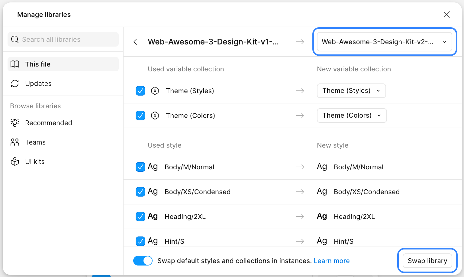
Swap in the new library in any design file using the design kit:
- Go to the Assets panel and open
Libraries - In the Manage libraries dialog, select
This file, find and select the old library - Press Swap library
- In the next view, select the new library from the dropdown at the top
- Press Swap library again to replace all components and styles from the old library
Keep Both Libraries Published as Long as You Need
Once everyone's set up their files with the new library, you can unpublish or delete the old library.
Version History
3.0.0
Added
- Added the following components:
- Accordion
- Checkbox Group
- Date Input
- Date Picker
- File Input
- Known Date
- OTP Input
- Time Input
- Toast
- Video
- Added the following variables:
- Font Size/3XS
- Font Size/5XL
- Space/5XL
- Form Control/Height/XS
- Form Control/Height/XL
- Form Control/Padding Block/XS
- Form Control/Padding Block/XL
- Form Control/Padding Inline/XS
- Form Control/Padding Inline/XL
- Form Control/Toggle Size/XS
- Form Control/Toggle Size/XL
- Added Start and End slots to Badge
- Added XS and XL options to the Size property for:
- Button
- Callout
- Checkbox
- Color Picker
- Input
- Radio
- Rating
- Select and Option
- Slider
- Switch
- Tag
- Textarea
- Added a Size property with XS, S, M, L, and XL options to Dropdown and Dropdown Item
- Added 3XS and 5XL variations of all Text Styles
- Added 3XS and 5XL options to the Size property for Badge and Icon
Changed
- Refactored the following components with slots:
- Cluster, Stack, Flank, and Split (Items slots)
- Button (Start and End slots)
- Breadcrumb (Items slot)
- Breadcrumb Item (Start and End slots)
- Callout (Message and Icon slots)
- Card (Content, Header, Header Actions, Footer, Footer Actions, and Actions slots)
- Details (Content, Expand Icon, and Collapse Icon slots)
- Dialog (Content, Header Actions, and Footer slots)
- Drawer (Content, Header Actions, and Footer slots)
- Dropdown (Trigger and Menu slots)
- Dropdown Item (Icon and Details slots)
- Input (Start and End slots)
- Popover (Content slot)
- Radio Group (Radios slot)
- Rating (Symbols slot)
- Select (Start, End, Listbox, and Tags slots)
- Option (Start and End slots)
- Tab Group (Nav slot)
- Tooltip (Content slot)
- Tree (Content slot)
- Renamed Small, Medium, and Large options for Size properties to S, M, and L for all components
- Updated Icon with Padding set to Fixed Width by default
2.0.0
Added
- Added components for Breadcrumb, Breadcrumb Item, Carousel, Color Picker, Copy Button, Details, Dialog, Drawer, Dropdown, Popover, Progress Bar, Progress Ring, Radio Group, Rating, Skeleton, Tab Group, Tab, Tooltip, Tree, and Tree Item
- Added Text Node component to better emulate Web Awesome's slot capabilities with Figma's Instance Swap properties
- Added Focus Offset, Hover color, and Active color variables
- Added Focus Ring effect style
- Added Arrow Padding Offset and Arrow Size Diagonal variables for sizing and positioning tooltip arrows
Changed
- Updated Checkbox, Input, Radio, Select, Slider, Switch, and Textarea with Focus and Disabled properties and with Instance Swap properties for label, start, end, and hint slots
- Updated Button with Focus, Disabled, Hover, and Active states
- Separated Button and Icon Button as separate components for performance
Removed
- Removed Typography component in favor of pairing Text Node with the existing Text Styles, which significantly reduces redundancy
1.0.0 🚀
Added
- Added initial variables and variable modes
- Added text styles for Body, Heading, Strong, Label, Value, and Hint text
- Added effect styles for shadows
- Added components for Typography, Layout, Avatar, Badge, Button, Callout, Card, Checkbox, Divider, Icon, Input, Radio, Select, Slider, Switch, Tag, and Textarea